Plotting with ggplot2
We already saw some of R’s built in plotting facilities with the function plot. A more recent and much more powerful plotting library is ggplot2. This implements ideas from a book called “The Grammar of Graphics”. The syntax is a little strange, but there are plenty of examples in the online documentation.
If ggplot2 isn’t already installed, we need to install it.
install.packages("ggplot2")We then need to load it.
library(ggplot2)Producing a plot with ggplot2, we must give three things:
- A data frame containing our data.
- How the columns of the data frame can be translated into positions, colors, sizes, and shapes of graphical elements (“aesthetics”).
- The actual graphical elements to display (“geometric objects”).
Using ggplot2 with a data frame
Let’s load up our diabetes data frame again.
diabetes <- read.csv("intro-r/diabetes.csv")ggplot(diabetes, aes(y=glyhb, x=age)) +
geom_point()## Warning: Removed 11 rows containing missing values (geom_point).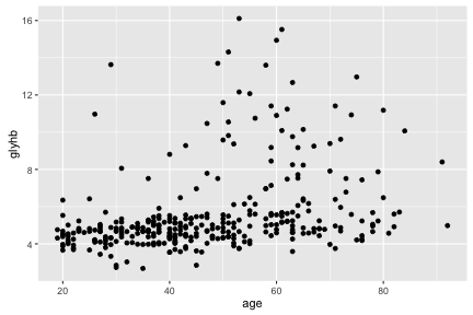
The call to ggplot and aes sets up the basics of how we are going to represent the various columns of the data frame. aes defines the “aesthetics”, which is how columns of the data frame map to graphical attributes such as x and y position, color, size, etc. We then literally add layers of graphics to this.
Seasoned programmers may notice with some alarm that aes does something very odd, since its bare arguments refer to columns of the data frame as though they were variables. To those programmers we comment briefly that R uses lazy evaluation of function parameters to allow any function to potentially behave like a macro, and that this is exactly as dangerous and powerful as it sounds. It’s used tastefully, for the most part.
Further aesthetics can be used. Hans Rosling would be excited!
ggplot(diabetes, aes(x=age, y=glyhb, size=weight, color=frame)) +
    geom_point()
## Warning: Removed 12 rows containing missing values (geom_point).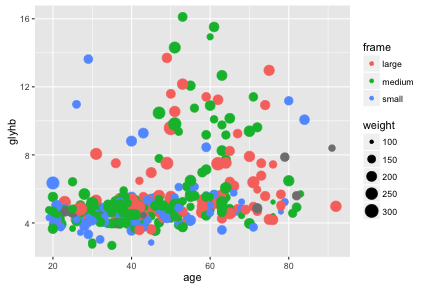
We can see some trend for glyhb to increase with age, and we tend to see medium and large framed people at higher levels of glyhb. Let’s try to show this trend.
ggplot(na.omit(diabetes), aes(x=age, y=glyhb, color=frame)) +
    geom_point() + geom_smooth(method="lm")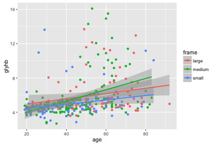
Hmm.
Some “geom”s have an associated “stat”. For example geom_smooth overlays a curve fitted to the data. You can see in the help it has a default parameter of stat="smooth" which calculates this curve. If there is a grouping of the data, for example by color, then separate curves are shown for each group.
geom_bar by default uses a stat called “count”, and so shows counts of rows in your data. (If you want to not use this stat, you could use geom_bar(stat="identity").)
ggplot(diabetes, aes(x=gender, fill=frame)) + geom_bar()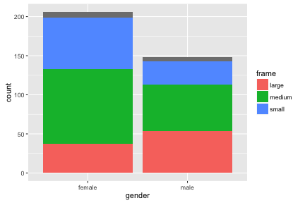
Challenge - Gapminder data
Use the Gapminder data you loaded earlier, or cheat and load it all with:
gap <- read.csv("intro-r/all-gapminder.csv")Plot life expectancy vs GDP per capita, coloring points by continent and sizing by year.
Using ggplot2 with a matrix
Let’s return to our first matrix example.
dat <- read.csv(file="intro-r/pvc.csv", row.names=1)
mat <- as.matrix(dat)
ggplot only works with data frames, so we need to convert this matrix into data frame form, with one measurement in each row. We can convert to this “long” form with the melt function in the library reshape2.
library(reshape2)
long <- melt(mat)
head(long)
## Var1 Var2 value
## 1 Resin1 Alice 36.25
## 2 Resin2 Alice 35.15
## 3 Resin3 Alice 30.70
## 4 Resin4 Alice 29.70
## 5 Resin5 Alice 31.85
## 6 Resin6 Alice 30.20colnames(long) <- c("resin","operator","value")
head(long)## resin operator value
## 1 Resin1 Alice 36.25
## 2 Resin2 Alice 35.15
## 3 Resin3 Alice 30.70
## 4 Resin4 Alice 29.70
## 5 Resin5 Alice 31.85
## 6 Resin6 Alice 30.20ggplot(long, aes(x=operator, y=value)) + geom_point()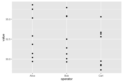
Notice how ggplot2 is able to use either numerical or categorical (factor) data as x and y coordinates.
More complex plots
ggplot(long, aes(x=operator, y=value)) + geom_boxplot() + geom_point()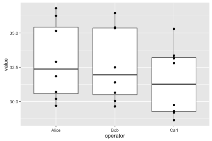
Lines need a group aesthetic.
ggplot(long, aes(x=operator, y=value, group=resin, color=resin)) +
    geom_line() + theme_bw()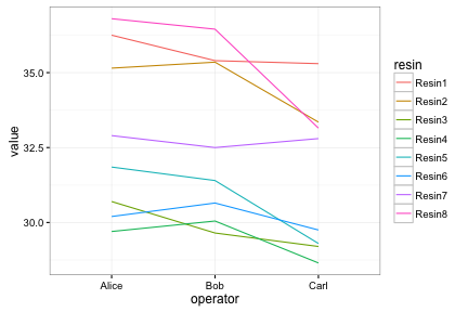
Faceting lets us quickly produce a collection of small plots.
ggplot(long, aes(x=operator, y=value)) +
    facet_wrap(~ resin) + geom_point() + theme_bw()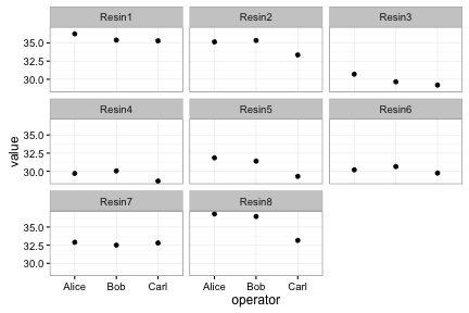
Saving ggplots
ggplots can be saved as we talked about earlier, but with one small twist to keep in mind. The act of plotting a ggplot is actually triggered when it is printed. In an interactive session we are automatically printing each value we calculate, but if you are using a for loop, or other R programming constructs, you might need to explcitly print( ) the plot.
# Plot created but not shown.
p <- ggplot(long, aes(x=operator, y=value)) + geom_point()

# Only when we try to look at the value p is it shown
p

# Alternatively, we can explicitly print it
print(p)

# To save to a file
png("test.png")
print(p)
dev.off()
See also the function ggsave.
Challenge - Gapminder data
Apply what you have just learned to explore the Gapminder data further.
Think of a way to summarise the Gapminder data with tapply and visualize the summarised data.