15 ReactomePA
Earlier in the book you used the Reactome website web tool to run ORA and visualise pathways, all based on the Reactome pathway database.
ReactomePA is the companion Bioconductor R package, providing scripted, reproducible access to the same pathway database, and integrates directly with the enrichplot visualisations used elsewhere in the book. The ReactomePA user guide can be found here.
Like the web interface, the ReactomePA R package can be used for ORA. However, this is more customisable and reproducible in R. The FCS/GSEA-style analyses are also possible using the R package (whereas these analyses on the Reactome.org website do not appear to be functional as of July 2026).
ReactomeDB does not just contain gene-sets but also directional and non-directional relationships between genes / proteins and metabolites in various pathways. This information can be extracted for downstream analysis of biological networks.
Activity overview
- Load input dataset (a gene matrix with adjusted P values and log2 fold change values)
- Change Gene IDs to Entrez IDs (required by Reactome)
- Filter for differentially expressed genes (DEGs) and create a gene list R object
- Run ORA with
enrichPathway()function - Visualise the results with
ggplot - Prepare for
FCSanalysis by generating pi-scores, incorporating significance and fold-change of DE genes. - Run a
FCSanalysis for up-regulated and down-regulated genes using thegsePathway()function - Visualise the
FCSresults using barcode plots - Visualise gene regulation magnitude, overlaid on pathway topology
- Export
reactomeDBdata for use with other tools
15.1 Set-up for analysis with ReactomePA
The complete executable analysis is included below. Run the code chunks interactively while working through the chapter, or render the full Bookdown project to execute the analysis and retain the code, parameters, results, figures, and software-version information in the book output.
15.1.1 Required Packages
Load the following libraries for this chapter:
library(ReactomePA)
library(AnnotationDbi)
library(org.Hs.eg.db)
library(enrichplot)
library(ggplot2)
library(ggrepel)
library(DT)
library(graphite)
library(igraph)
15.1.2 Load input data
Raw data from et al 2017 was subjected to differential gene expression analysis with Degust and the results file saved to Pezzini_DE.txt.
The input data file can be fetched using its URL by read.csv().
pezzini <- read.csv("https://raw.githubusercontent.com/MonashBioinformaticsPlatform/Functional_Enrichment_Web_and_Command_Line/refs/heads/main/data/R_data/Pezzini_DE.txt", sep='\t', header = T)
colnames(pezzini)
The dataframe shows genes with fold change and FDR values, along with gene counts values for the 6 samples (2 groups with 3 replicates each).
Look on the environment pane of RStudio, and you can see a description ‘14420 obs. of 11 variables’ - this shows your dataframe consists of 10 columns and 14,420 genes.
15.1.3 Match Ensembl Gene IDs to Entrez Gene IDs
Reactome requires Entrez-style gene IDs, which are just numbers.
Example Human Gene IDs from different DBs
| Ensembl Gene ID | Gene Symbol (HGNC) | Entrez Gene ID |
|---|---|---|
| ENSG00000141510 | TP53 | 7157 |
| ENSG00000139618 | BRCA2 | 675 |
| ENSG00000215252 | GOLGA8B | 23015 |
| ENSG00000175265 | GOLGA8A | 23015 |
| ENSG00000146648 | EGFR | 1956 |
| ENSG00000121879 | PIK3CA | 5290 |
| ENSG00000148362 | PAXX | NA |
| ENSG00000223972 | DDX11L1 | 100287102 |
| ENSG00000227232 | WASH7P | 653635 |
| ENSG00000198786 | MT-ND5 | 4540 |
Note that some Gene IDs do not have a one-to-one mapping to genes in other databases. Some are listed as two separate genes, or can be completely absent. This is also often the case for different releases of the same database.
Currently the data only has Ensembl-style IDs and HGNC/Symbolic-style names. The online tool we used converted these automatically, but here we have to do it ourselves.
We can use the mapIds() function from the AnnotationDbi package for this.
# to get a list of available keytypes, use: columns(org.Hs.eg.db)
pezzini$entrez <- mapIds(org.Hs.eg.db,
                    keys = pezzini$Gene.ID, # Use column "Gene.ID" in "pezzini" (which contains Ensembl gene ids) as query.
                    column = "ENTREZID",    # retrieve ENTREZID values associated with the query values
                    keytype = "ENSEMBL",
                    multiVals = "first")
# How many ensembl IDs mapped to NO Entrez IDs?
sum(is.na(pezzini$entrez))
# How many ensembl IDs mapped to the same Entrez IDs? Remove NAs because they will be counted as duplicates
sum(duplicated(pezzini$entrez) & ! is.na(pezzini$entrez))
# What type of data does R think pezzini$entrez is? Should be "character" but sometimes R mistakes it for numeric
class(pezzini$entrez)
Note on $: $ is used to indicate one column or field. Here pezzini$entrez <- assigns the results into a new column entrez in the table pezzini.
There should be 16 gene IDs that are now duplicated after converting to Entrez IDs from Ensembl IDs, and 116 have no Entrez ID at all. This is not unusual since different gene databases will sometimes regard two regions as the same gene while others will split the region into different genes.
Filtering the data:
To ensure everything runs without errors, let’s get rid of NAs/duplicates for Entrez IDs:
nrow(pezzini) # rows pre-filter
pezzini <- pezzini[!is.na(pezzini$entrez), ]      # get rid of rows where Entrez-id was not found
pezzini <- pezzini[!duplicated(pezzini$entrez), ] # get rid of duplicate rows of Entrez-id (retains first row)
nrow(pezzini) # rows post-filter
Note on square-bracket notation ie. table[row,column]: here we generate logical filters for the rows, and no filter at all for the columns.
15.2 ORA analysis in ReactomePA
15.2.1 Create DE gene list for ORA in Reactome
Let’s look at all differentially expressed genes at FDR < 0.01 and log fold change of expression > 2 (regardless of the direction).
Collect Entrez IDs from the pezzini$entrez field, filtering by pezzini$FDR < 0.01 AND abs(pezzini$Log2FC)
degs <- pezzini$entrez[pezzini$FDR < 0.01 & abs(pezzini$Log2FC) > 2]
length(degs) # how many DEGs are in this list?
We should have 790 genes passing our filters.
15.2.2 Run ORA in Reactome
Now run the ORA. This may take a couple of minutes. We specify the background gene set using the universe argument.
RPA <- enrichPathway(gene = degs,
                     universe = pezzini$entrez,            # use all entrez IDs in "pezzini" as background
                     pvalueCutoff = 1, qvalueCutoff = 1)   # get all results, filter later.
RPA_df <- as.data.frame(RPA)
Lets look at the top 8 entries:
# No need for 'qvalue' (column 10) as it is redundant with p.adjust.
# Also, Column 11 is too big, it lists all genes in the overlap. Remove them from display using negative subscripts.
datatable(RPA_df[,-c(10,11)]) %>%  formatRound(columns=c('RichFactor', 'FoldEnrichment', 'zScore', 'pvalue'), digits=3)
We do get quite different results if we only include up- or down- regulated genes. Depending on our hypothesis and how we think the pathways involved may function, we might do this by changing the filter for DEGs above. However, this would take extra computational time so we won’t do it here.
15.2.3 Plot some results of ORA
We can use ggplot to plot statistical significance vs. fold-enrichment, and show gene-set size using point size. With ggrepel we can also label pathways. We won’t go too much into ggplot here suffice to say that it is a powerful framework for data visualisation.
ggplot(data=RPA_df,
       aes(x = FoldEnrichment,
           y = -log10(p.adjust),
           label = Description)) +
  geom_point(aes(size=Count), alpha=0.5) +
  geom_text_repel(data = RPA_df[ RPA_df$p.adjust < 0.001 ,  ], size=2.2) +
  theme_bw()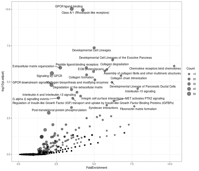
15.3 ReactomePA Functional Class Scoring
Rather than drawing an arbitrary threshold to classify genes as either regulated or not, we can assess the distribution of genes in each pathway over a continuous metric related to gene expression, such as fold-change, statistical significance, or signal-to-noise ratio.
The reactome.org website offers some FCS analysis (e.g. using the CAMERA algorithm) but as of July 2026 these features appear not to be working reliably. However, we can perform them in R.
15.3.1 Generate a gene ranking metric
When we want to rank genes, we face a conundrum of whether to use the magnitude of the experimental effect or the statistical significance.
¿Por qué no los dos?
“pi-score” is a combination of P-value and Log-fold change proposed by Xiao et. al 2012
Note: Using pi-scores is slightly hacky. More statistically valid ways of combining effect magnitude and significance exist, for example preserving the T- or F-statistics from the orginal DE gene identification in Voom / Edger / DESeq in the output from those tools. Alternatively, the TREAT or CONFECT tools can run a trade-off between effect size and significance. But we will use pi-scores here as they are easily calculable from the metrics we have in our table of results.
pezzini$pi <- -log10(pezzini$FDR) * pezzini$Log2FC     # calculate "pi" score
pezzini <- pezzini[order(pezzini$pi, decreasing = TRUE),]      # sort pezzini table by "pi" score
plot(x = pezzini$Log2FC, y = pezzini$pi, cex=0.1)      # plot "pi" vs Log-fold change
15.3.2 Generate gsePathway input
We will use ReactomePA’s function gsePathway(). It accepts input in the form of a named vector of significance metrics, where the names are the geneIDs.
The following code creates suitable input:
15.3.3 Run ReactomePA Functional Class Scoring
Now let’s run gsePA. This might take a couple of minutes.
gsePA <- gsePathway(geneList = pi_vals,
                    pvalueCutoff = 0.2)
gsePA_df <- as.data.frame(gsePA)
By default, pathways are filtered for > 10 nodes and < 500 nodes by gsePathway().
15.3.4 Browse top pathways
# exclude column 11, it lists geneIDs: too much info to display. Also don't need 8 (qvalue)
datatable(gsePA_df[,-c(8,11)]) %>%  formatRound(columns=c('enrichmentScore', 'NES', 'pvalue', 'log2err'), digits=4)
The Normalised Enrichment Score NES and the qvalue/p.adjust fields (here, both are just FDR again) represent concepts of effect size and statistical significance, respectively.
15.3.5 Visualise gsePA results in barcode plots.
Make barcode plots of 5 most significant pathways
gseaplot2(gsePA, geneSetID = 1:5)
These are all downregulated pathways: let’s also get best UPregulated groups:
The barcode plots give a good idea as to how significance is calculated. The grey profile at the bottom represents each gene’s ranking value, in this case, pi-scores. They can be negative for the genes at the bottom of the list, and the highest weightings are usually for genes at the very top or bottom of the list, as these are most informative.
The Running Enrichment Score (RES) is a cumulative sum of this metric, for genes within the pathway being analysed, minus the cumulative sum of genes outside the pathway. A random distribution of pathway genes after ranking should produce a largely flat RES. The highest (or lowest) value for the RES is the raw Enrichment score. This represents the skew of pathway genes to one or both ends of the ranked list. The Normalised Enrichment Score NES is generated from the raw enrichmentScore after normalising for the “expected” enrichment score (obtained by permuting genes).
15.4 Visualise ReactomeDB Pathways
We can visualise pathways with the viewPathway function, overlaying each node’s actual expression change using colour.
Here we will instead use the “pi” values since we have already made a named vector containing them.
viewPathway("Downstream signaling of activated FGFR2",
            readable = TRUE,
            foldChange = pi_vals,
layout = 'kk') 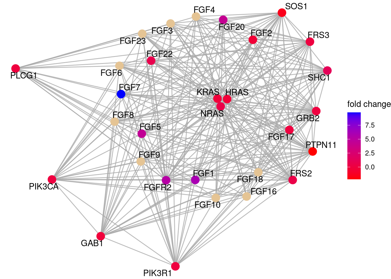
Unlike in the online visualisation, viewPathway does not display directionality. This is not as pretty as the web version! But the data is able to be exported to other visualisation tools (e.g. in the DiagrammeR package) if needed.
Other interesting pathways can be found in the Description field of the gsePathway() output table, e.g. “PI3K/AKT Signaling in Cancer”, “Chemokine receptors bind chemokines”, “Response to elevated platelet cytosolic Ca2+”
15.5 Exporting reactome pathway data
Let’s say we have a different visualisation tool we want to use. ReactomeDB data can be exported in the form of a pathway object of the graphite package, and from there it can be exported as table of relationships (edges) between proteins or metabolites (nodes). These relationships are a mix of directed (e.g. in a signalling pathway when one protein acts on another) or undirected (e.g. when a pair of proteins form a complex with each other).
pathName = "Downstream signaling of activated FGFR2"
pw <- pathways(species = 'hsapiens', "reactome")[[pathName]]  # get pathway from reactome.
# by default these will have UniProt protein names: convert to gene names:
pw2 <- convertIdentifiers(pw, "symbol")  # Convert UniProt names to HGNC GENE SYMBOLS here
class(pw2)

# convert to table:
pw_edges <- graphite::edges(pw2, which = "proteins") # options for 'which': "proteins", "metabolites", "mixed".
# Caution: both igraph and graphite packages have a function called "edges()"! Specify "graphite::edges()" here.
# NOTE: it is possible to combine all edges:
# pw_edges_all <- rbind(pw2@protEdges, pw2@metabolEdges, pw2@mixedEdges)
# but this can be a LOT of edges to display!
datatable(pw_edges)
15.6 Plotting exported network and expression data using ggplot
Visualising data in ggplot is great because you can customise it readily. We can actually preserve directional network relationships too if we are careful.
First, how do we generate x / y node positions for a plot? We can use one of the many methods in igraph (layout_with_fr(), layout_with_kk(), etc.)
ig <- igraph::graph_from_data_frame(pw_edges[,c('src', 'dest')]) # convert to a minimal igraph object
lay <- igraph::layout_with_kk(ig)  # lay is now just a 2-column table of x and y positions using 'kk' method
# export "lay" into a dataframe with columns 'node', 'x', and 'y'
node_layout <- data.frame(node = V(ig)$name, x = lay[,1], y = lay[,2] )
# merge in node expression data
node_layout$LFC <- pezzini$Log2FC[ match(node_layout$node, pezzini$Gene.Name)]
Now use the node coordinates to define start and end coordinates for the lines, and plot directional and non-directional edges.
# merge coords back into pw_edges by SOURCE node, as 'x' and 'y'
pw_edges2 <- merge(pw_edges, node_layout, by.x = 'src', by.y = 'node', all.x=T)  # output as pw_edges2
# merge coords back into all_edges by DESTINATION node, as 'x_dest' and 'y_dest'
pw_edges2 <- merge(pw_edges2, node_layout, by.x = 'dest', by.y = 'node', all.x=T, suffixes = c('', '_dest'))

# plot undirected and directed edges as separate layers, so we can use red arrows for the directed edges:
plt <- ggplot() +
  geom_curve(data = pw_edges2[pw_edges2$direction == 'undirected',],
               aes(x = x, y = y, xend = x_dest, yend = y_dest ), alpha=0.5, curvature = 0.2) +
  geom_curve(data = pw_edges2[pw_edges2$direction == 'directed',],
               aes(x = x, y = y, xend = x_dest, yend = y_dest ), color='red', alpha = 0.5,
               arrow = arrow(type='closed', length = unit(0.1, "inches")), curvature = -0.2) +
  geom_point(data = node_layout,
             aes(x = x, y = y), size=2.5) +
  ggrepel::geom_label_repel(data = node_layout,
             aes(x = x, y = y, label = node, fill = LFC), fontface = 'bold', alpha = 0.7) +
  scale_fill_gradient2(high = 'red', mid = 'grey', low = 'green') +
  theme_void()
print(plt)
# save plot to a large-ish pdf
pdf('FGFR2_network.pdf', width = 12, height = 12)
print(plt)
dev.off()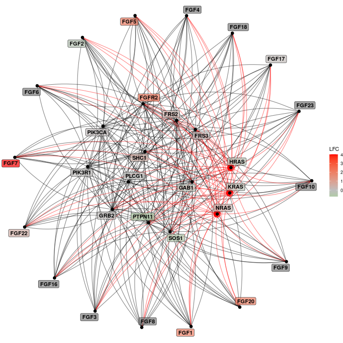
This should save the plot to a pdf file in the current working directory.
15.6.1 R version and R package versions
It is good practice to capture and record the version of R and other session details including all loaded packages and versions with the sessionInfo() function:
15.7 End of activity summary
- We have extracted a gene list and background gene list from a DE dataset and run ORA with the
reactomePAenrichPathway()function - We plotted the data with a
ggplot2dotplot - We have run a
reactomePAFCS analysis separating up and down regulated genes - We plotted the top up- and down- regulated pathways as barcode plots
- We visualised pathway networks, overlaid with a gene-regulation metric from our experiment
- We extracted reactome networks in tabular form for export
- We plotted reactome networks in ggplot preserving directional edges